Color Contrast: Making Your Business’s Website More Accessible
- July 2, 2018
- / Renea Dumas
- / Accessibility
As of 2016, approximately 3.8 million people in the US between the ages of 21 and 64 were either blind or had serious difficulty seeing (Statista, 2018). For those individuals living with a visual impairment, navigating the internet to engage with businesses online can be frustrating and often impossible. To ensure that the internet is accessible to all, the US, and many other countries, have adopted international web accessibility guidelines into their own legal codes. One of the most important web accessibility guidelines for accommodating visually impaired users is the use of contrasting colors.
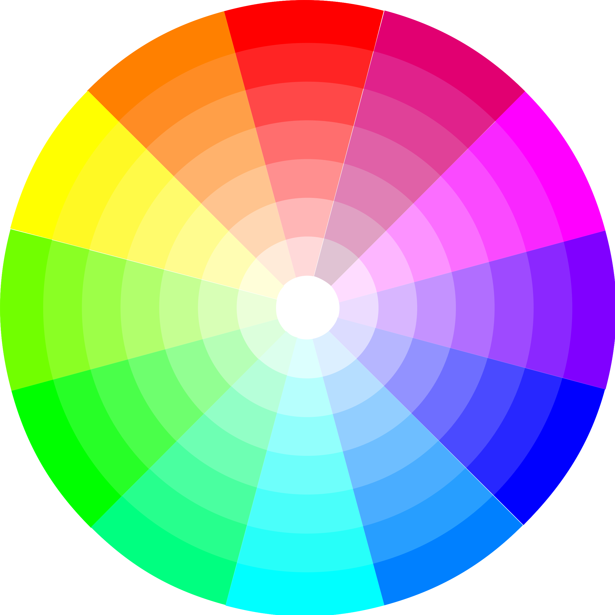
Vision & Web Accessibility
Approximately 1 in 20 people have some form of visual impairment related to the perception of color. Red-green color vision defects are the most common form of color vision deficiency, occurring in about 1 in 12 males and 1 in 200 females (Wey, 2015). To accommodate this large portion of the population, and others with various other forms of visual impairment, the Worldwide Web Consortium (W3C), as part of its Web Content Accessibility Guidelines (WCAG 2.0), has established guidelines for sufficient color contrast (Drupal, 2017).
Why Your Business Should Care
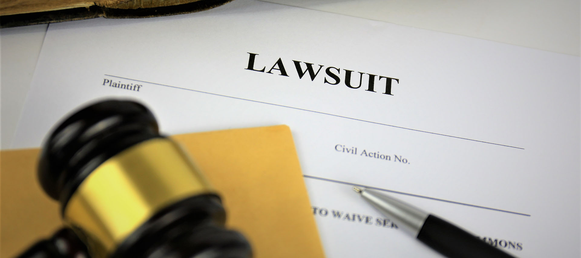
Since 2013, there have been approximately 26,211 lawsuits filed in Federal court against American businesses for website accessibility issues. In recent years, American legislation related to web accessibility has become increasingly stringent (Shaw, 2018). As of January 18, 2018, American businesses who fail to comply with the WCAG 2.0 standard for color contrast will be found in violation of Section 508 of the recently updated Rehabilitation Act of 1973. Those businesses whose websites currently violate WCAG 2.0, and Section 508, are likely targets for litigation under Title III of the American’s with Disabilities Act. For this reason, ensuring that your business’s website is following established color contrast guidelines is essential for preventing expensive litigation.
In addition to preventing litigation, there is also a business case for adhering to WCAG 2.0: The more customers your business has access to, the more profit you can generate. If your business’s website is not accessible to the 3.8 million Americans with visual impairments, then you are missing out on an immensely valuable consumer market. Additionally, having an accessible website will help to ensure high-quality customer service, improve SEO, and foster stronger customer relationships.
How to Comply
Color contrast on a website is measured using ratios. The established guidelines for sufficient color contrast ratios on a website, according to WCAG 2.0, are as follows:
For large text, such as headings:
- A color contrast ratio of at least 3:1 normally provides sufficient contrast. (Level AA)
- For enhanced contrast, a color contrast ratio of at least 4.5:1 is necessary. (Level AAA.)
For regular text:
- A color contrast ratio of at least 4.5:1 normally provides sufficient contrast. (Level AA)
- For enhanced contrast, a color contrast ratio of at least 7:1 is necessary. (Level AAA.)
Other tips for improving content legibility on your business’s website include:
· The larger / wider the font, the more legible it will be with lower contrast – contrast requirements for large font are lower. W3C recommends beginning at 18pt regular weight or 14pt bold text.
· Provide tools for users to adjust the foreground and background colors of your site. This gives users more control over the contrast ratio and accommodates everyone using your site, regardless of what kind of visual disability they may have.
· Avoid ‘text-based’ images – use text whenever possible or consider using a high resolution for text images. Don’t forget to fill out the alt text!
Every day, American businesses are blindsided by web accessibility lawsuits. These lawsuits, which may cost your business tens of thousands of dollars in legal fees, could be avoided by simply changing the color of your website’s text. Take the preventative steps to protect your business against expensive litigation; check your website’s color contrast by visiting www.accessible-colors.com. To learn more about web accessibility, and becoming WCAG 2.0 compliant, go to www.adotlabs.com or contact us.
Sources
Drupal. Specifying colors and contrast for accessibility. (2017, March 15). Retrieved June 18, 2018, from https://www.drupal.org/docs/7/creating-accessible-themes/specifying-colors-and-contrast-for-accessibility
Moroshko, M., & Arnautović, V. Accessible Colors | WCAG 2.0 AA and AAA color contrast checker. Retrieved June 18, 2018, from http://accessible-colors.com/
Shaw, S., LLP. (2018, February 01). ADA Title III Lawsuits Increase by 16% in 2017 Due Largely to Website Access Lawsuits; Physical Accessibility Legislative Reform Efforts Continue. Retrieved June 04, 2018, from https://www.adatitleiii.com/2018/02/ada-title-iii-lawsuits-increase-by-14-percent-in-2017-due-largely-to-website-access-lawsuits-physical-accessibility-legislative-reform-efforts-continue/
Statista. (n.d.). Topic: Vision problems in the U.S. Retrieved June 18, 2018, from https://www.statista.com/topics/3494/vision-problems-in-the-us/
Vasquez, R. R. (2015, January 05). What is Color Contrast? Retrieved June 18, 2018, from https://a11yproject.com/posts/what-is-color-contrast/
Wey, H. (2015, May 22). Web accessibility tip: Keep colour contrast in mind for images with text | Web Resources. (2018, February 09). Retrieved June 18, 2018, from https://uwaterloo.ca/web-resources/blog/post/colour-contrast
W3.org. Contrast (Minimum): Understanding SC 1.4.3. Retrieved June 18, 2018, from https://www.w3.org/TR/UNDERSTANDING-WCAG20/visual-audio-contrast-contrast.html
Recent Posts
-
 Federal Web Accessibility Lawsuits Nearly Triple In 2018
-
 Life, Liberty, and the Pursuit of Pizza
-
 Adot Labs is now CommonAccess
-
 How I See It: Business Websites vs. the Disabled
-
 Blind People Use Computers?
-
 Web Accessibility Doesn't Stop for Summer Break
-
 Are You Ready to Party this Cinco de Mayo?
-
 Designing with Visual Page Builder is Easy
-
 Strength in Numbers
-
 Small Businesses Celebrate Mother's Day